
Your attention, please!
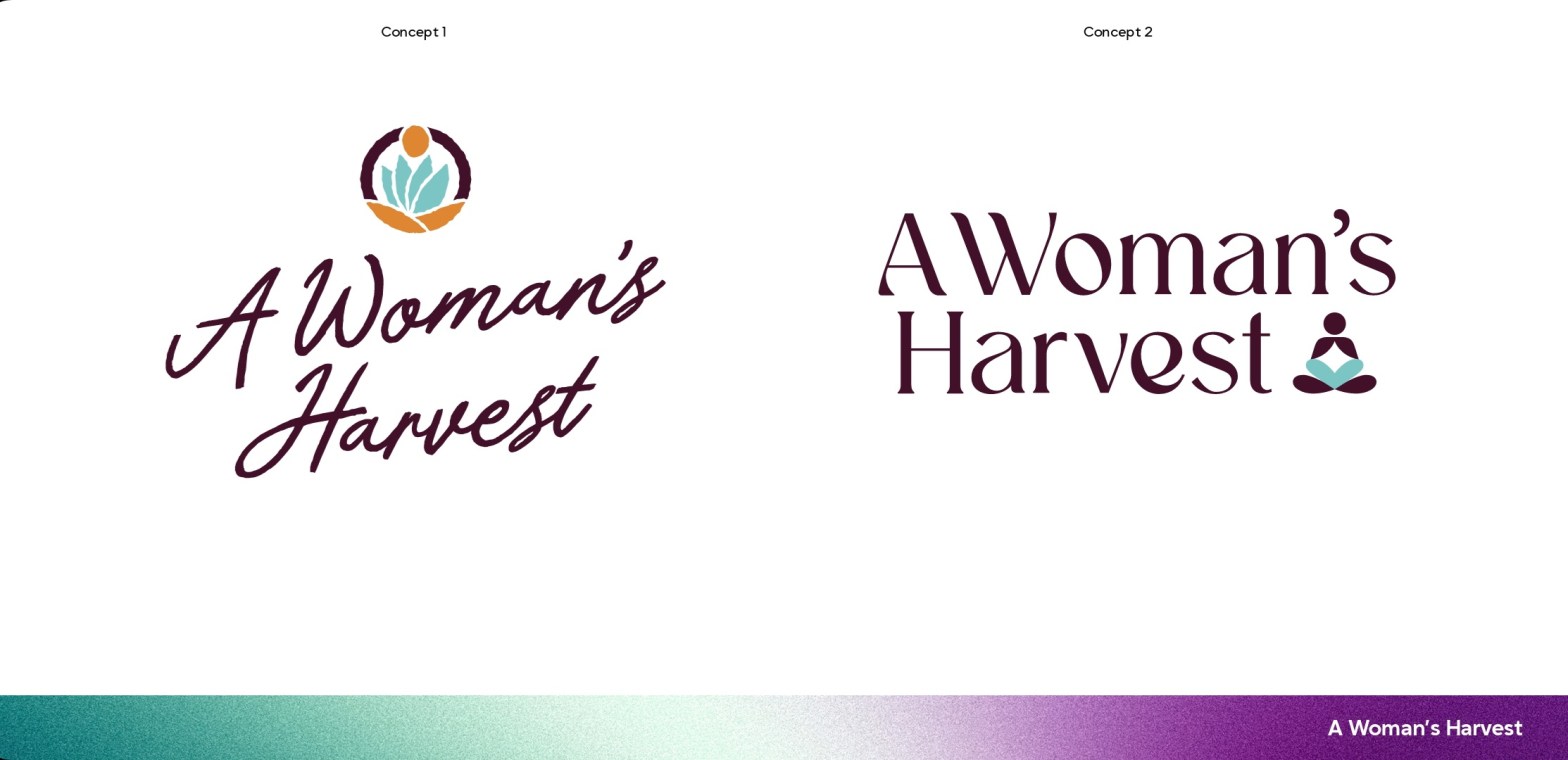
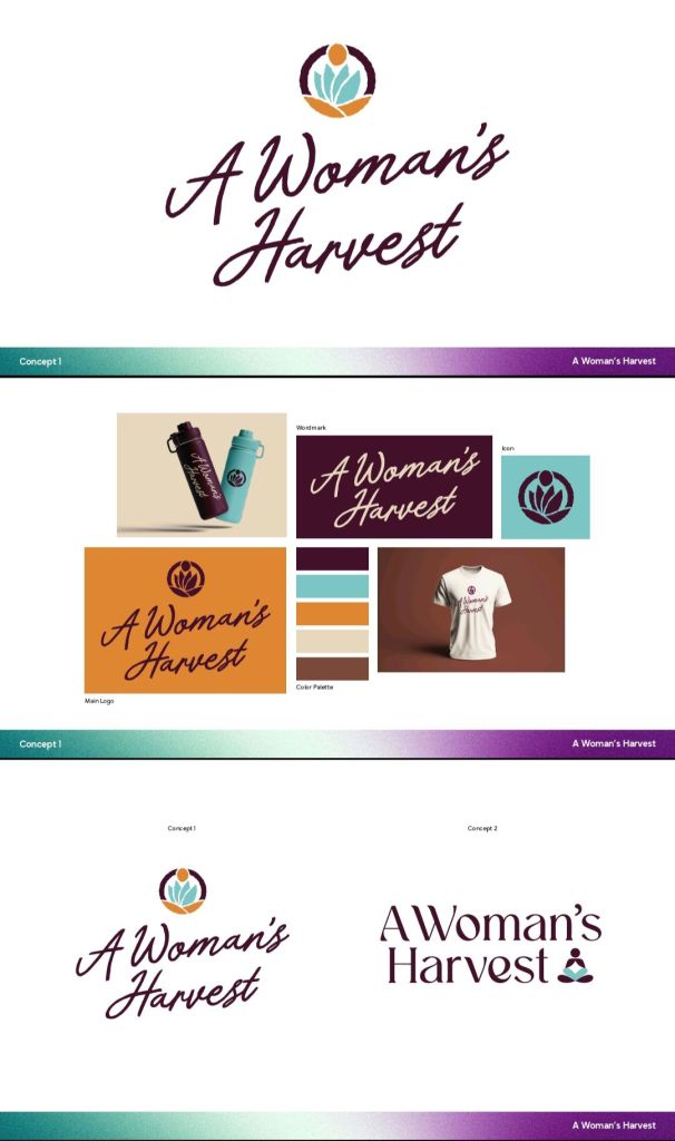
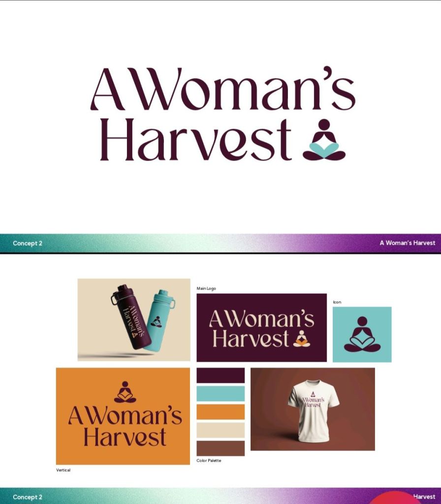
I’ve engaged a graphic designer to develop a logo for A Woman’s Harvest, Inc. I love the concepts she delivered. Would love to know what others think. I trust my instincts, but I also enjoy receiving feedback and perspectives from outside my mind.
I provided color ideas; she selected the color shades, tones and depth. I asked for simple, airy and earthy. She designed with that in mind. I think she did a wonderful job.
If you have a moment, please tell me what, if anything, attracts you to the logo/font/design? Does anything pull you in? Does anything trigger an interest to learn more about what A Woman’s Harvest is doing?
Of the two concepts, do you like one design more than the other? If so, why? If you like neither, why not? If you like elements of both, which elements do you like and why?
Based on the design, what type of tagline would you expect to see with this?
You can visit awomansharvest.org for more information on programs and plans.
Many thanks!
LaShawnda
Discover more from A Woman's Harvest
Subscribe to get the latest posts sent to your email.

One thought on “Logo Design Options”